So I decided to create my first portfolio website. I want to find a job after the technical school, because they don't teach me very well here! I don't want to go to work in a factory…
This is my first serious article, don't judge me harshly!
Okay, let's go straight to day 1 of the site's creation.
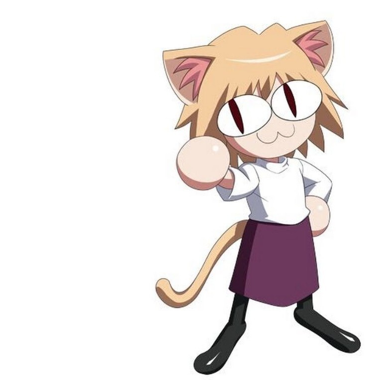
At first, I thought about what my website would look like. The answer was not long in coming: I like one character from the Metely-Blood universe, and I decided to create a website dedicated to Neco Arc.
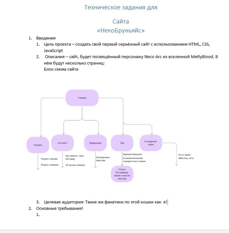
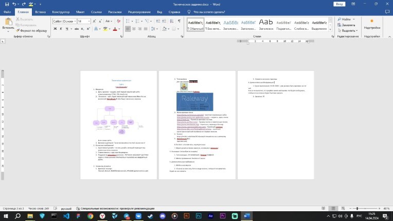
During the class, I took out my laptop and decided to make a technical task first. This will help me understand what needs to be done, and may also be useful in the future.
I named my website "Neko Brugnais". "Neko" is a reference to the name Neko Ark, and " Brugnais "is a play on words from" Brugna "and"site".
Then I started writing the terms of reference. It was standard: names, descriptions, basic requirements, font selection. I also decided to make a mobile version of the site. I set myself a deadline of September 1, 2024. I think I'll make it.
In addition, I went to FigJam, where I created a header layout and a menu for navigation.


Second day of website creation!
I have improved the requirements for the technical task. It now includes responsive design, cross-browser compatibility, and support for retina displays.
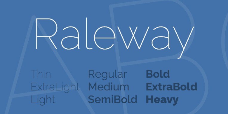
I also chose fonts for the site: Patsy Sans and Raleway. They look good and are suitable for this project.
Now I'm just starting to work on the site. During my training, I actively used Figma to study design.
The main color of the site is #6d395d, and the secondary color is #f5e6d8.


And on the third day
Finally, I completed the technical task. I selected seven sites as samples and found a resource with code for buttons. Now I plan to add small animations to my website. This is just the beginning.

Well, on the 4th day of creating the site!
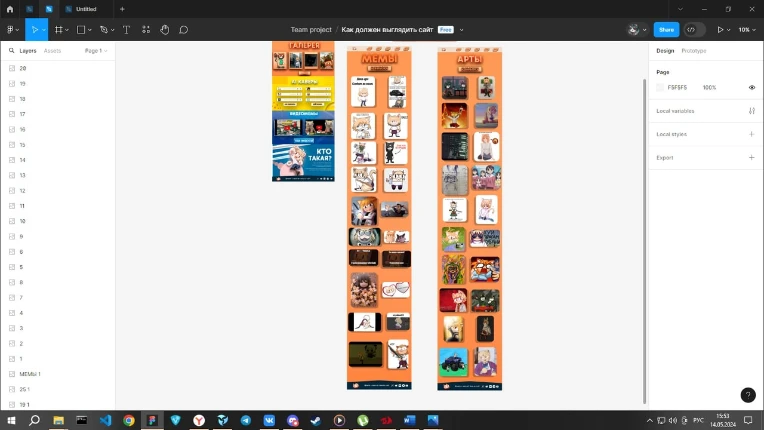
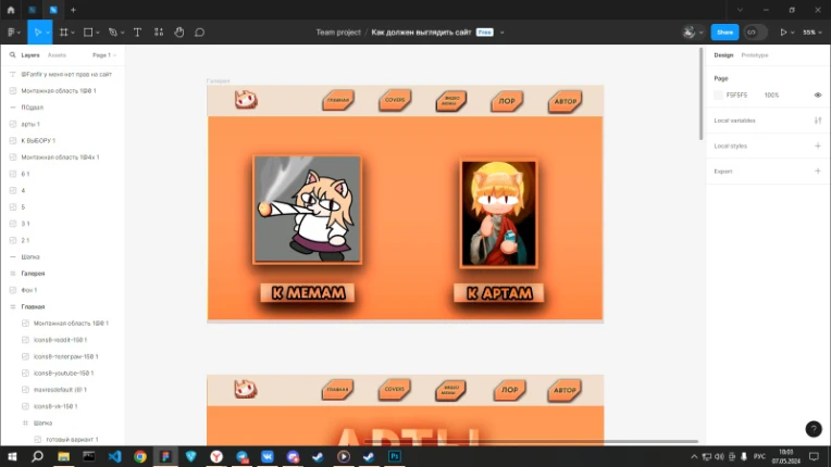
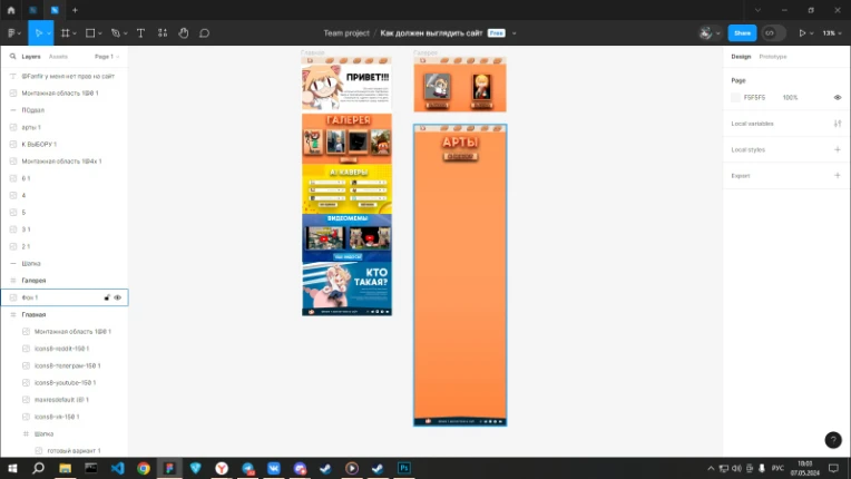
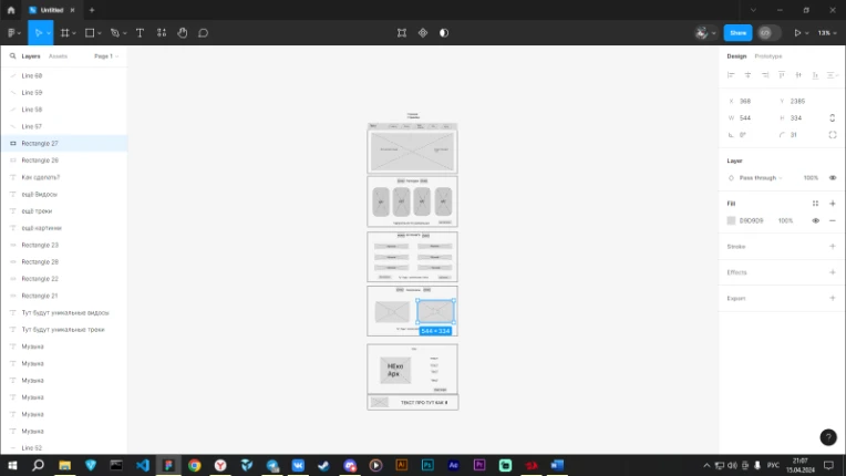
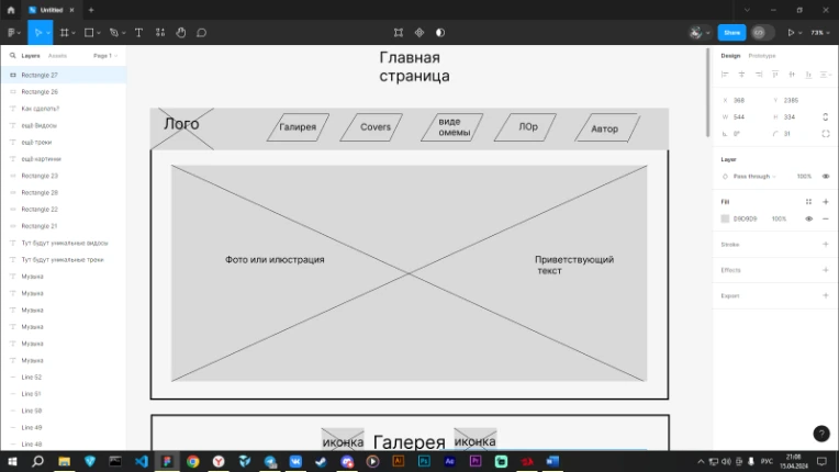
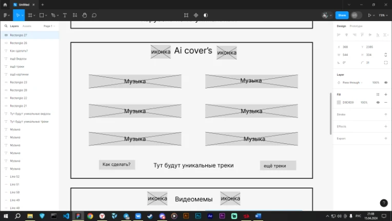
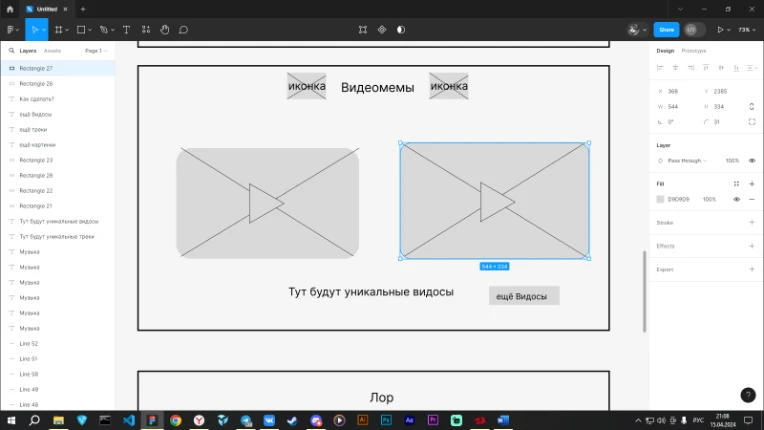
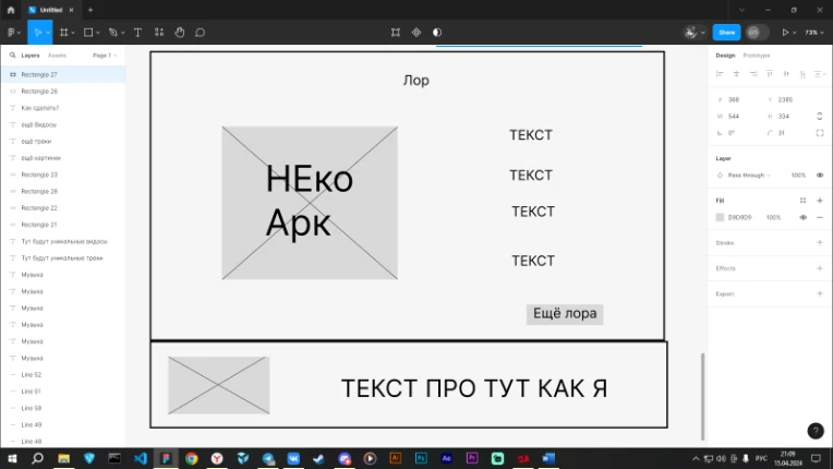
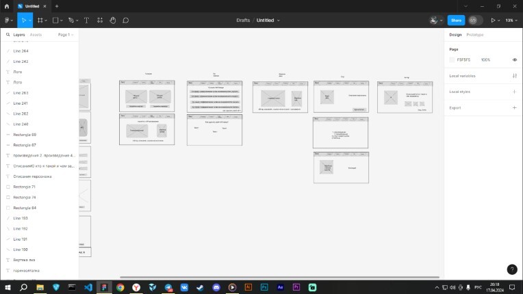
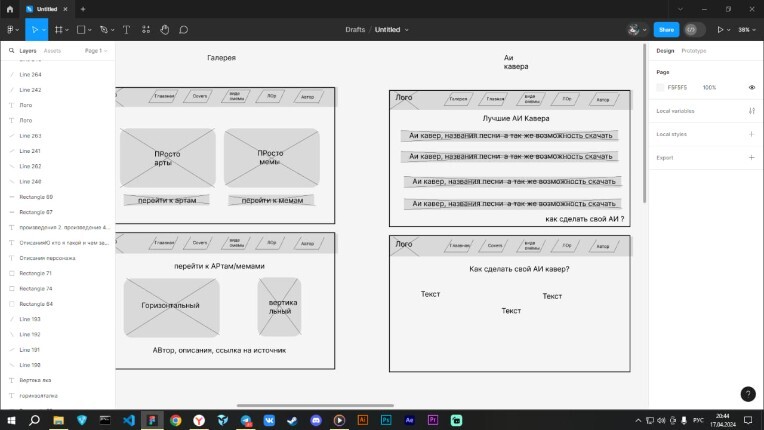
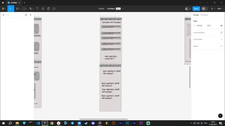
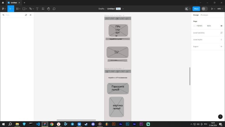
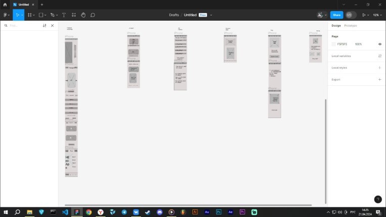
I decided to start working on a website layout in Figma. First of all, I want to create the main page, but I won't stop there — I plan to develop several additional pages. The main page will contain a short version of the site, while other pages will be more detailed.


So 5 day!
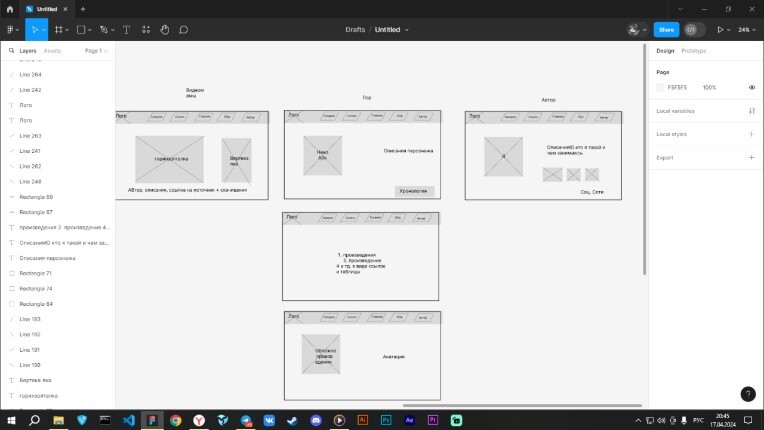
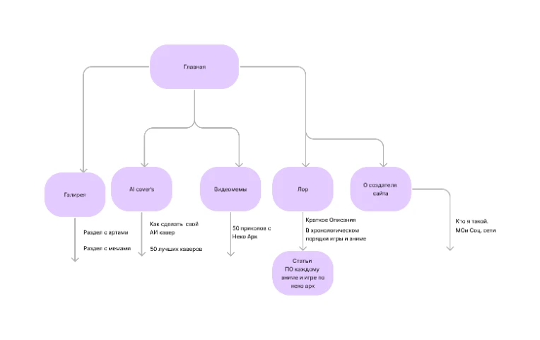
I decided to create separate pages for the site. Here's what I plan to do:
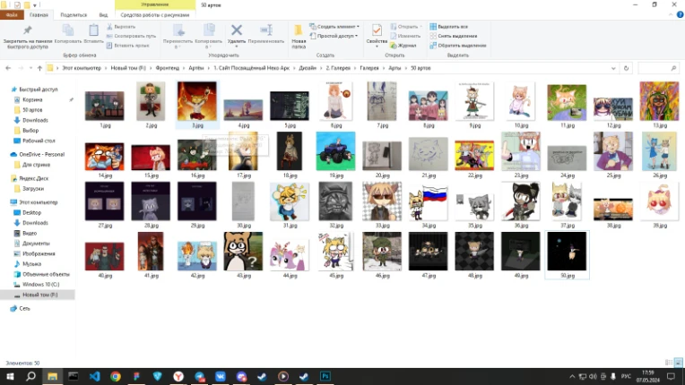
* Each page will feature 50 pieces of art from our VKontakte group.
* There will be 50 photo memes.
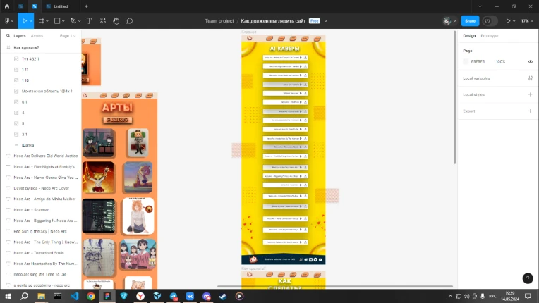
* There will be 50 covers.
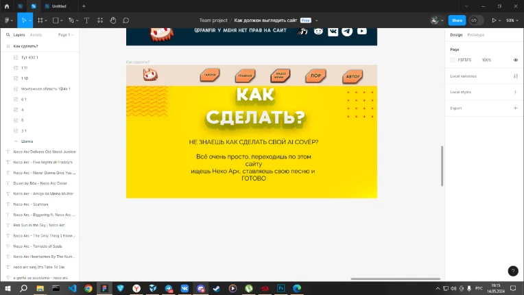
* And there will be a guide for creating your own AI cover.
But as for creating an Ent, I don't know what to do yet. It seems that this will simply be a description of what she does in the universe and in what works she appears.


And now we move on to day 6…
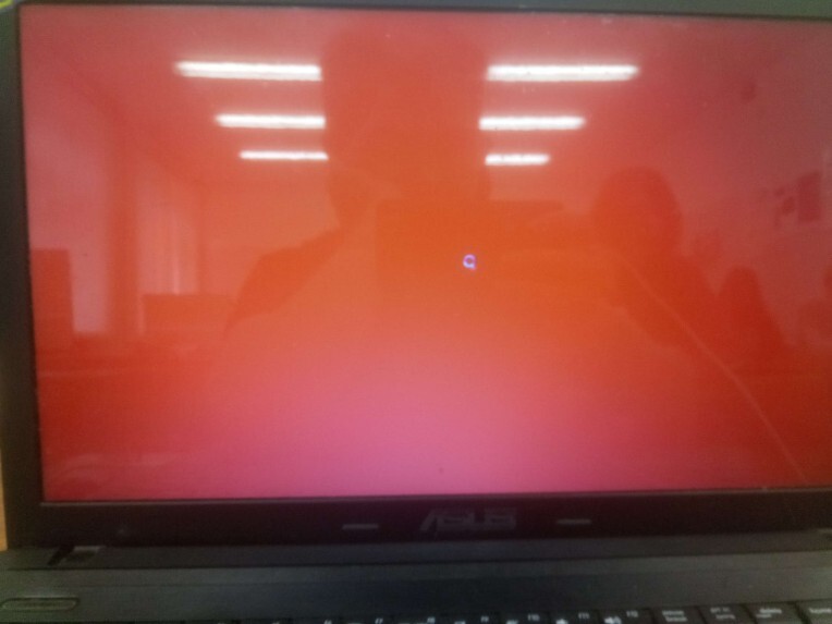
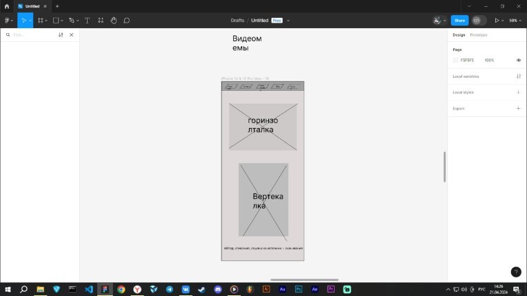
Unfortunately, my laptop overheated and I couldn't continue working. All the black pixels on the screen turned red. I tried to fix the problem, but without success. I spent most of my time trying to solve this problem. As a result, I created a frame only for the mobile version of the site.

So, it's already 7 days!
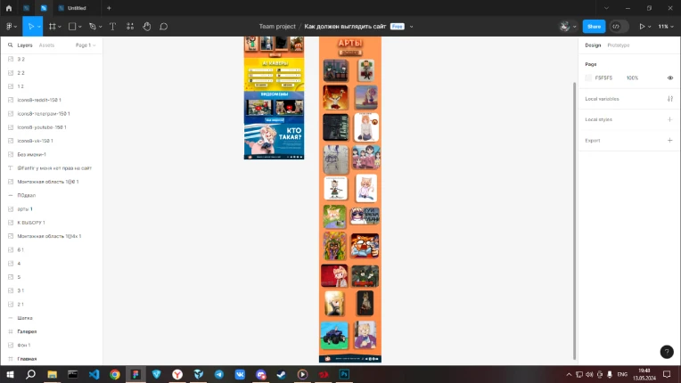
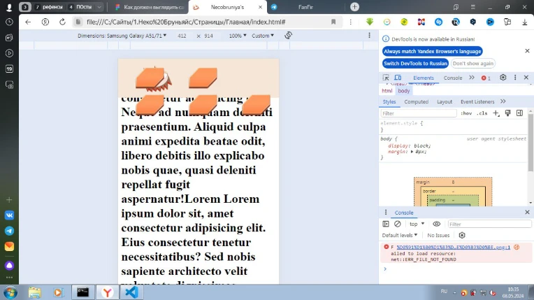
I created a layout for the mobile version of the site. In general, it doesn't differ from the PC version, but I added a point about site adaptability.
My laptop needed some rest, and now it's working properly again.


And it seems Nyugrounds forbade me to send out pictures, well, sorry without them... For this reason, you have a reason to go to my YouTube channel or Vk Group to see what I'm getting)
And on the 8th day I got my sight!
I need to study not only at the technical school, but also at home! I decided that other hobbies could wait, but I had plenty of time.
I drew a logo in Adobe Illustrator and started painting it over. However, I noticed that I hadn't painted it between the eyes. Well, that's okay!
I also used a style from the library, which I found very cool!
I also created a button in the form of a 3D object, which flies up a little when hovering. In addition, I have a version with text on the buttons that I will use.
Unfortunately, due to lack of time, I managed to make only the background.
The 9th day of the website creation site is coming!
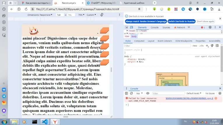
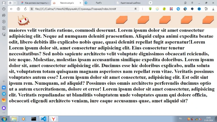
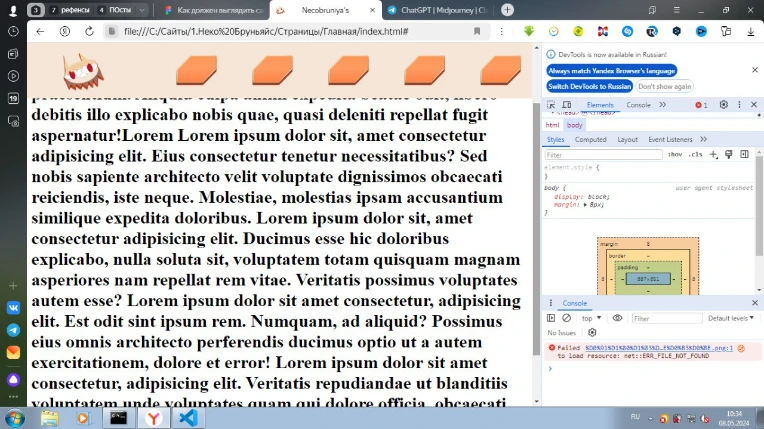
I started working on creating a navigation menu. I've already written a small HTML code for it.
And in 10 days, I decided to change the background!
I realized that it didn't look very good, but still decided to make changes to the terms of reference. I also decided to do an experiment and choose different colors for each page and each element of the main page. This may make the image too bright and chaotic, but I'm not very well versed in this issue yet, although I'm fond of design. Well, the first time can be forgiven.
11. Website Creation Day!
Today, on the first pair, I started creating the design of my website. I started with the header or navigation menu. Added buttons, but no text – I'll add them soon. I also want to fix the header and add working links, and then create a responsive design! The buttons will contain logs, so that everything is as it should be!
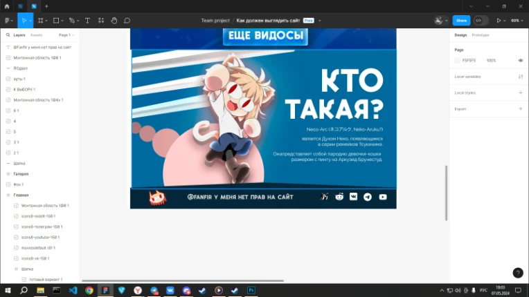
Yesterday I noticed that the design is not quite suitable for a first impression or slide, but more like "ent". There will be a description of who Neko Ark is, not a user greeting. Well, okay, I think I'll implement it later.
I want to experiment with the color theme to make it interesting. I know that you need to use 4 colors: white, black, primary and secondary. But that's okay!
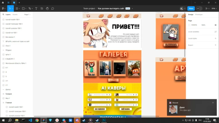
I chose blue for the video memes and made them in 20 minutes. But I can see that it's not quite accurate. Nothing, it'll do for the first time. Then I'll change it in photoshop or Figma. I added a couple of videos to see what it will look like. I think it's fine!
But with AI Cover, it was hard. Today I spent about an hour and a half trying to feel the proportions. I see that it's not exactly pixel accurate. Plus, the toxic yellow color makes you dizzy. We'll have to make it darker. I'll do it tomorrow.
Day 12 of website creation!
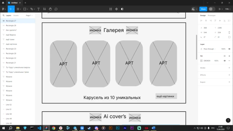
I created greetings for new users and a gallery that works like a carousel. This means that you can scroll through the gallery to the right and left, and there will be 10 unique images!
It only took me an hour to create the gallery. I have already prepared the design in Figma and now I can see what it will look like. In general, at first glance, everything looks good.
I also made a basement of the site. You will need to make the icons white. Also, we need to work on the icon for a normal user.
Well, I'll have to correct all my spelling mistakes tomorrow. It's amazing how I don't notice them! You also need to design all the other pages so that they match the style of the main page.
This is my first big article, and it may not be completely clear. I don't even know how to write such voluminous texts myself.
I will be grateful for your advice and recommendations. I would like to know your opinion: am I doing everything right? Maybe you can tell me how best to write articles?
With that, I'll say goodbye. Thank you for your attention! If you are interested, you can read my first blog article about creating a website.
